(Home)
Obsessed With 2022’s Green Decor Trend? Don’t Make This Color-Pairing Mistake
Here’s what to do instead.

There’s really no question why green has become 2022’s go-to color in the home. As HomeGoods Style Expert Jenny Reimold explains, “It’s a designer favorite due to its ability to create warm and inviting spaces that can be styled across a wide variety of color palettes.” Because of this, its popularity shows no signs of slowing down. “No matter the shade or tone of green, it is being incorporated into all interior design projects, residential and commercial spaces,” Margarita Bravo, founder and chief creative officer of her eponymous interior design studio, tells TZR. That said, its versatility can counterintuitively make it challenging to use at home — especially when you’re trying to decide which colors pair best with the type of green you’re using.
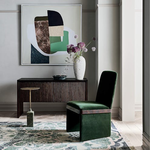
Of course, there are some rules of thumb that interior designers abide by. For Bravo, sticking to a tonal palette is key. “This means if we are using a soft sage, we will stick with softer, more natural colors,” she explains. “If we are working on a formal living room which incorporates the use of dark, rich emeralds and velvets, we will choose to stay in that rich, jewel-toned family.”
If this feels intimidating to you, make sure to start your journey with green by slowly adding it into the space. “When incorporating an on-trend color in your home, I suggest clients test the waters first versus diving in headfirst,” says HomeGoods Style Expert Beth Diana Smith. “A great way to incorporate greens into a room instantly is through decor and accessories.” That way, you can practice mixing it with other hues and it won’t be difficult to fix if a combination goes awry.
Regardless of the approach you take, there are specific colors that designers recommend that will make decorating with green easier. And while it comes down to personal preference in the end, they can still serve as guidance in moments of uncertainty. Their expert color-pairing advice, ahead.
We at TZR only include products that have been independently selected by our editors. We may receive a portion of sales if you purchase a product through a link in this article.
What Colors Go With Rich Greens?
Like Bravo mentioned, sticking with a tonal color palette will never steer you wrong, especially when working with richer green tones. Many of the other designers TZR spoke to agree.
“I love seeing emerald green with other jewel tones like sapphire blue, purple amethyst, ruby, or a vibrant yellow,” says Smith. “This assortment creates a rich and saturated color palette; a palette I especially love if I’m going for a maximalist or bohemian look.” HomeGoods Style Expert Ursula Carmona suggests “a muted deep crimson with purple undertones, paired with dark hunter green pillows, and dark green accessories” if you’re going for a jewel-like vibe. And if you’re itching to make a true statement? “Emerald green looks show-stopping paired with bold patterns and hints of reddish orange,” says Bravo. “After all, green corrects red on the color wheel, and the use of a burnt orange will only make the green pop more.”
That said, those aren’t your only options when it comes to greens like emerald. According to Reimold, you can also use natural wood tones and neutrals like greige, white, and gold alongside the color. And if you want a bohemian look, you can even pair rich greens with bronze, rose gold, and terracotta textures, she continues.
There are, of course, a few hues you should avoid when working with this color family. Smith says she would skip pairing a richer green color with browns and taupes, “unless you really know what you are doing with color; [otherwise,] the palette can feel quite dismal.”
What Colors Go With Soft Greens?
Reimold dubs sage one of “Mother Nature’s most popular colors, especially this year.” So yes, the chances of you using it in your home are high.
Though it’s considered a calming color, there are actually a lot of “vibes” you can take with this softer shade. As Reimold explains, it can actually act as a neutral “and be paired with ivory, taupe, or gray” if you’re pursuing an organic aesthetic. Or, for a crisp, modern look, use it alongside black and white. (Smith also recommends warm grays or whites for this.) More of a maximalist? “Try pairing it with pinks, purples, and brasses to create a bold, yet beautiful look that emulates a jewelry box,” says Smith. And for an earthy feel, Carmona says she would “look for a terracotta color to pair with sage green.”
On the other hand, continues Smith, “I don’t recommend pairing sage with browns, yellows, or a lot of black as it can feel quite dark or dreary.”