(Home)
If You’re Not Into Sage Green, Try This Equally Tranquil Decor Color Trend Instead
You’ve got options.

Sage green seems to be the color on every decor lover’s lips this year; it’s the chosen hue of paint brands, and interior designers and influencers are using it everywhere. It’s beautiful, to be sure; but if you’re not really a fan (or it just doesn’t fit into your home), you may feel like you’re out of luck when it comes to decorating. That’s where you’re wrong, though — because while the soothing green hue may be a popular one right now, there are several other home decor color trends this year that are not only just as stunning, but designer-approved.
Fortunately, there’s also one for basically every preference. Whether you want a shade to add to your space that’s equally serene, or you’re looking for a tone to brighten the mood, the experts say there’s a color trend for you. And, like sage green, these hues can be incorporated in many ways.
“If the layout allows, I love incorporating colors through paint,” Kathy Kuo, interior designer and CEO of Kathy Kuo Home, explains of how to use this season’s trends at home. “I find it’s a great way to make a statement and allows you to utilize core furniture pieces to ground the rest of the design.” Want something that feels less permanent? “Throw pillows, faux florals, and even smaller pieces of furniture like ottomans are great options when looking to decorate with color,” Kuo continues. “Alternatively, I might go with a bolder pop on one of the main upholstery pieces such as the sofa or separately an area rug, as it can really establish a mood and main focal point.”
Not only are there plenty of alternatives to sage green if it just isn’t your thing, but it’s just as easy to add 2022’s most-desired hues to your space. So don’t settle on a tone you don’t like just because it’s everywhere; instead, scroll ahead for four worthy alternatives.
We only include products that have been independently selected by TZR's editorial team. However, we may receive a portion of sales if you purchase a product through a link in this article.
Blue
For those that want a color with sage green’s tranquil properties? Kuo says shades of blue are a solid alternative. “In general, blue is a great option for a calming space because it injects it with lightness and color, and if there’s already an abundance of natural light in a space, blue will make a room gleam,” she tells TZR in an email. “I particularly gravitate toward powder blue, cornflower, or robin’s egg because of their soft and clean finishes.”
Not only can these shades give a room a peaceful feel, she continues, but they also allow for layering properties. In addition, using blue is a great way to incorporate sage green (if you’re still curious about the trend), but not make it the focal point of the room. “When decorating specifically with blue, I like pairing greens or yellows within other elements of the design,” Kuo explains. “Both blue and green and blue and yellow create a fresh and sophisticated tone. And depending on the specific hue you select, it can also warm the space, adding to the soothing ambiance.”
Teal & Orange
Looking to get more playful with color trends this year? Kuo also recommends teal and orange as a “fun complementary combination.” According to the designer, “This combination is bold in itself but can be made trendier by incorporating diverse materials such as woods and metallics to make the overall design more dynamic.” Another tip she has for pulling it off at home? “Selecting a darker teal shade can help ground accents of vibrant oranges, instead of trying to make two bright colors work together and potentially clashing.”
Warm Jewel Tones
Anyone who favors the bold will be happy to know that Lynne Tocchet, Director of Interior Design at Pacaso, says “the most impactful trend” this spring is the resurgence of color. “Warm jewel tones will be seen in rich hues, such as burnt orange throw pillows on the sofa and bedding with deep blue and green accent patterns,” she shares. “The translation of the world's need for warmth and comfort will bring back a very happy pallet of color. White, white, white, is out, out, out!”
Brown
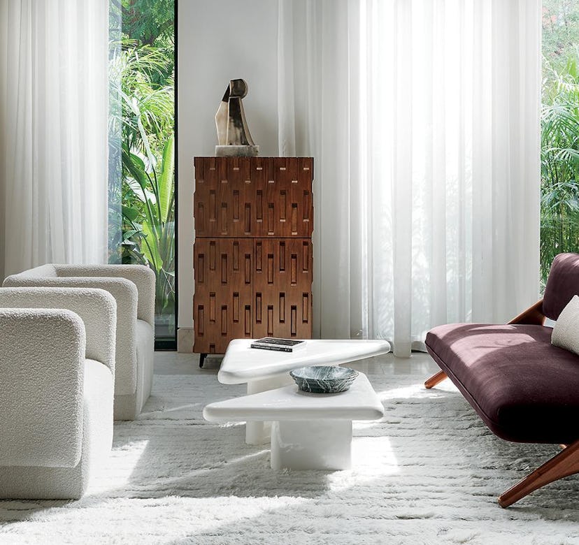
That said, those who prefer neutrals need not worry. Because according to Tocchet, another popular color this year is actually brown. “Our desire for warmth and comfort is driving this trend of mixing wood tones in all different shades of brown, creating a sense of peacefulness,” she notes. “The layering of textures we saw last spring with white and natural textiles to create depth in a space takes a bigger leap with furniture.” Thus, she continues, antique pieces, unique case goods, and wood furniture “with personality” are making comebacks. So, “don't be afraid to mix warm wood tones and go back to the soothing hues of years past.”
This article was originally published on