(Home)
How To Try The Citrus Paint Colors You’re Seeing Everywhere, According To Experts
They’re not as scary as you think.

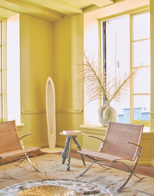
Many designers agree that there’s been a marked shift toward bold hues in design as of late. “This year in particular, we are seeing more color and getting more requests for it which we attribute to the fact that bright colors make people happy!” Beth Dotolo and Carolina V. Gentry, interior designers and co-founders of Pulp Design Studios, tell TZR in an email. It’s especially noticeable on walls — you can plainly see from Instagram the increase in colorful shades taking over previously beige rooms. Yet out of the entire spectrum of choices, there’s one category of hues seeing an obvious increase in love: It’s the citrus paint color trend, and it’s all but taken over.
Not only have celebrities adopted it into their homes en masse (just look at the bright orange walls of Gigi Hadid, Mindy Kaling, and Emilia Clarke), but yellow was also one of Pantone’s 2021 Colors of the Year. It’s a movement, says Charlotte Cosby, the Head of Creative at Farrow & Ball, that’s defined by a gravitation toward shades that offer nostalgia and warmth — not surprising, considering many of us just spent a year reminiscing over non-pandemic days and wishing for a vacation in the sun.
Regardless of the newfound popularity yellows and oranges are experiencing, though, it doesn’t change the fact that decorating with such sunny colors can be a challenge. Bright paint in general is often scary, but especially with playful hues that can turn garish and cheesy so easily. Not that you should let that stop you from infusing some happiness into your home, but it is worth taking notes from the experts on how to use them correctly. Ahead, some advice from Dotolo, Gentry, and Cosby to help guide you.
Citrus Paint Color Trend: Choose The Right Room
As you might have guessed, citrus shades (especially the brighter ones) work better in some spaces than others. “Both yellows and oranges are energizing colors according to color psychology, so in their truest sense not the ideal choice for rooms where you need to switch off and relax,” Cosby explains. Therefore, you may want to avoid them in something like a bedroom — though she says that you can use “more nuanced shades” such as deeper ochres in soft coral or terracotta if you’re set on this family, as they can “still offer some visual rest and more importantly warmth.”
On the other hand, there are some rooms that will truly benefit from such an energizing color. “Yellows and orange tones can be a great choice for a home office for someone in the creative industry due to their energy,” continues Cosby. “Yellow is also an excellent choice for a hall or kitchen and pale terracotta would be great in a bathroom — its warm, peachy glow will work wonders for your complexion.”
Citrus Paint Color Trend: Edit Your Use
Though floor-to-ceiling use of citrus hues can certainly have a stunning effect, you don’t always have to commit so heavily to reap their benefits. In fact, if you’re feeling uncertain about your bold color choice, a little hint is all you need.
“When incorporating citrus shades, longevity should be considered,” say Dotolo and Gentry. “Our team uses it in really edited ways. A pop here and there is sometimes all you need to get the full effect.” That can even be in the form of a few pillows or a single piece of furniture, they explain, if paint feels too overwhelming.
Citrus Paint Color Trend: Consider Color Value
Don’t just pick any old shade and expect it to work, say Dotolo and Gentry. “Always request samples and think about the color value — how bright or muted is it? Does it go more red, more yellow?” they share.
Again, this plays into the psychology of color and how it will affect your response to the room. Choosing a bright color like orange, say the designers, will elevate your blood pressure. But as Cosby previously stated, a more muted version could actually provide some “visual rest.” So, take home a few samples and try things out on your walls before you commit to see how it reads at home and what its effects will be.
Citrus Paint Color Trend: Pair Wisely
Of course, you can pair together whatever colors you choose — as long as you like it, that’s all that matters. That said, each expert offers a few guiding principles, if you’re not sure what else to use alongside these sunny shades.
“Blues and greens are always good to pair with yellows and oranges,” offer Dotolo and Gentry. Alternatively, they say, you can try them with colors next to each other on the color wheel. “When you do this, the tones blend well into each other.”
Cosby, on the other hand, shares some more specific ideas. “Try our Citrona on kitchen cabinets in Modern Eggshell for a fresh and unexpected look — if clean is your thing, team with Salt,” she says. Wanting a richer note? “Our classic Citron from the core collection is a lovely sunshine shade and would be stunning in a sun-drenched entrance hall teamed with a soft white like Wimborne White on your trim.”
We only include products that have been independently selected by TZR's editorial team. However, we may receive a portion of sales if you purchase a product through a link in this article.
This article was originally published on