When it comes to color, there's no better authority on the subject than Pantone. Every year the company carefully selects a shade they predict will be everywhere — including the fashions that come down the runways and the home decor items you use to spruce up your space.
For 2018, the saturated, blue-purple tone Ultra Violet was chosen for its depth and complexity to reflect the current state of affairs. With the same amount of thoughtfulness Pantone gives to its Color of the Year pick, it also hones in on a handful of colors for fall, based on trends in fashion and other kinds of commerce, like beauty products and automobiles. As luck would have it, it seems that some of the biggest brands for home decor are also taking note of these trending hues and offering products from furniture to chic accent pieces — all in Pantone's palette. (And beyond that, there are plenty that cost less than you'd think.)
If you're looking of ways to integrate some of the season's most relevant shades — as indicated by Pantone's experts — read on to find a list of budget-friendly finds that will give your home a chic fall feel — without feeling cheesy or cliché.
Valiant Poppy
Valiant Poppy, as the name suggests, is a punchy yet rich shade of red. Pantone says it's a "brave and outgoing red shade effusive in its allure." Imagine the classic red lipstick that makes you feel like you can go out and conquer the world having the same effect on your bedspread or sofa.
Ceylon Yellow
According to Pantone, Ceylon Yellow is a "savory and spicy yellow" that "adds an exotic touch" wherever you place it in your home. Imagine turmeric or mustard-y shades — much deeper than the sunny yellow hue we've seen throughout spring and summer. Try it as a fun pop of color on your wall via printed wallpaper or on your coffee table via a chic vase.
Russet Orange
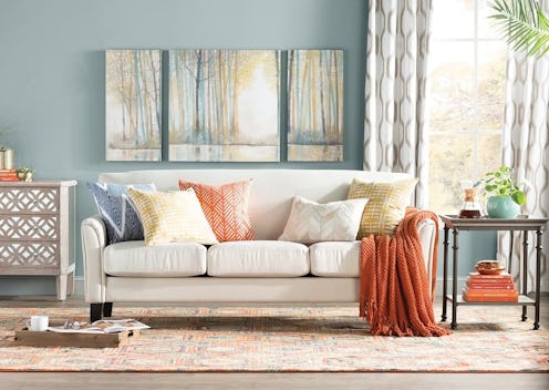
Russet Orange is the quintessential fall color. Pantone describes it as the "forest floor orange speaks to earthen warmth." Think of it as the perfect saturated pumpkin shade that will pop in your home but that's still muted enough to blend into whatever existing color schemes you've got going on. Use the shade to warm up a room via a cozy throw blanket or fun accent chairs.
Martini Olive
Pantone's Martini Olive is the ultimate neutral. The brownish-green color is described as a "smooth, sophisticated, and urbane green," and it's a shade that feels both autumnal and versatile for pieces in all parts of your home all year round. Sorry, beige, you've been replaced.
Red Pear
Warmer toned than its aforementioned red counterpart, Red Pear is described as "deliciously deep," luscious, and enticing — much like the fall fruit it's named after. To find just the right shade, look for pieces that are more of a sumptuous scarlet, with a slightly more purple undertone (as opposed to an orange one).
