While many people are in the throes of planning the new year from a health, fashion, and travel perspective, a handful are focused on refreshing their homes without breaking the bank. A surefire way to do so is to switch up the color scheme.
But what if you're not interested in incorporating the 2026 Pantone Color of the Year, Cloud Dancer, despite the notion that it’s meant to encourage relaxation and focus? For those who want to lean into maximalism in 2026, you’ll be relieved to hear that thinking outside the box and leaning into vibrant colors and lush textures is still a go for the year ahead.
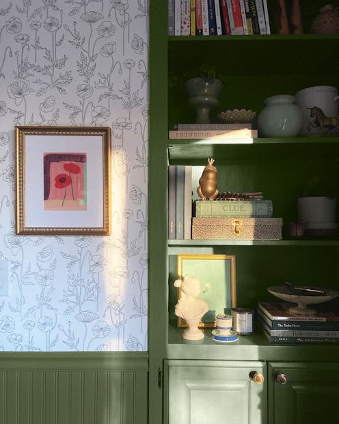
In fact, celebrity interior designer and founder of R&R Interior Design 365, Regina Reaves, predicts a jewel-tone comeback this year. "Colors like emerald green, electric blue, and turquoise have their stake to claim in homes for the bold and daring," she shares with TZR.
And that’s just the tip of the colorful iceberg. Need some inspiration to jumpstart your redecorating? Scroll down to find unique hues and decor tips from trusted experts to help you jazz up your home in the new year.
Maroon
Jenna Morrow, interior designer and founder of Morrow Design Studio, believes that deep reds will add richness and sophistication to each space. "The hues will span from deep reds that are softened by brown undertones and reds that blend purple shades," she tells TZR.
Teal
Morrow suggests using saturated blue-green hues to add quiet drama to the home. Teal adds a nice pop to your home's walls, so try using it as a statement color on kitchen and bathroom cabinetry.
Khaki
If jewel tones are not your thing, that's OK. According to Morrow, soothing shades of beige and tan are also back in style. Khaki creates a warm, earthy environment throughout the home by adding a dash of elegance and curating a timeless look that's soft and approachable.
Peach
Award-winning interior designer, Latisea Calton of Latisea Calton Designs, believes that the trend toward warm colors is here to stay. The color Before Sunrise is soft, beautiful, and unashamedly feminine, Calton described. "Whether used as an accent color or a backdrop, it provides restorative warmth and balance. Without demanding attention, it elevates everything around it with quiet beauty," Calton states. Before Sunrise stands out for embodying softness, calm, and emotional intelligence. This color is a perfect contrast of warmth without reading yellow or beige.
Emerald Green
Reaves of R&R Interior Design 365 recommends this color to highlight the special details in your home. “There is nothing like an emerald green paint saturated in a room with great architectural details. It brings out all the characteristics that make the eyes wonder over every line in awe,” Reaves says. “This space is ready for a nice dinner with friends and family or an ultra fine dining experience with your spouse. The opportunities are endless when you use a beautiful color like this in your home.”
